
Shipment assignment screen — legacy UI
Redesigning the warehouse packing experience to reduce cognitive load, support new workflows, and improve packing speed for 100,000+ fulfillment center associates
Pack App is the primary interface fulfillment center associates use to pack and ship customer orders. It tells packers where to pick up their items (from a chute wall or tote), how many items to scan, whether there are special requirements (hazmat labels, heavy labels, slips), and what packaging to use (bag, box, or machine). Once everything is packed, the shipment goes on a conveyor and out the door.
Amazon was investing in a next-generation pack station: replacing aging keypads with touchscreen displays, introducing new packing workflows (wrapping, automated packaging machines, batched singles), and standardizing UI patterns across all warehouse workstations. This was a chance to rebuild Pack App from the ground up using the company's accessible design system, fix years of accessibility debt, and design for how packers actually work: glancing at a screen for seconds at a time during 10-hour shifts.
Shipment assignment screen — legacy UI
The legacy Pack App had been functional for years, but it was built for a different era: keypad navigation, dense information display, and no consideration for accessibility standards. As Amazon prepared to roll out new pack stations with touchscreen displays and new packing workflows, the old UI couldn't keep up.
The legacy UI had serious accessibility issues. Color contrast failed to meet WCAG guidelines in multiple places (white text on neon green backgrounds, for example). Font sizes were too small to read from the 2–5 feet away that associates actually stand from their screens. For people working 10-hour shifts and glancing at the screen for only a few seconds per shipment, legibility isn't a nice-to-have. It's a safety and efficiency requirement.
The old UI tried to show everything at once: text, colors, illustrations, status indicators, and instructions all competing for attention. But experienced packers (and it only takes a week or two to become one) don't need all of that. They need to glance at the screen, understand what to do, and get back to work. The dense layout created unnecessary cognitive load and slowed people down.
The legacy Pack App was built for a single packing workflow: pick items, build a box, pack, tape, ship. But the new site introduces entirely new tasks that associates have never done before: wrapping items in bags instead of boxes, placing items into a USP machine that builds packaging automatically, and packing batched singles from high-velocity chutes. The old UI had no way to guide associates through these unfamiliar workflows.
This wasn't just a UI refresh. Amazon was standardizing the experience across all warehouse workstations so that cross-trained associates encounter consistent patterns (like scan feedback) no matter which station they're at. The move from keypads to touchscreens also simplified hardware maintenance, replacing a tangle of cables and peripherals with a single swappable display. And with 100,000+ associates using Pack App, even small improvements in packing speed (UPH) translate to massive operational savings.
I'm the sole designer on this team, owning end-to-end UX from discovery through launch. That means everything from field research to final specs to illustration.
On-site observation and packing, time trial experiments, virtual design reviews with area managers and associates across North America and Europe
Defining MVP scope, prioritizing workflows for launch, influencing what to cut (like the color zone concept) based on evidence
Wireframing, prototyping, visual design, touchscreen interaction patterns, illustration creation, handoff documentation, and ongoing iteration based on field feedback
This was the most important finding. Experienced packers (and it only takes 1–2 weeks to become one) glance at the screen for a few seconds per shipment. They aren't reading, they're scanning for the one or two pieces of information they need. This reframed the entire design challenge: we weren't designing for engagement, we were designing for instant comprehension at a glance.
The legacy UI showed item lists, box codes, box descriptions, box locations, and illustrations of the full pack station setup. But associates already know where the boxes live. They can look at a code and know exactly what to grab. We stripped out the explanatory subtext, the item-by-item lists, and the detailed scene illustrations. What remained was a cleaner, more directed flow showing only what's essential for each step.
The color zone experiment confirmed what observation had already suggested: associates don't need the UI or the environment to tell them where to go. They internalize the station layout quickly and rely on minimal text cues ("USP" or "Wrap") to know their next action. Designing for this meant resisting the urge to over-communicate.
Associates aren't sitting at a desk. They're standing, moving, carrying items. The screen needs to be legible from a distance, which meant larger fonts, higher contrast, simplified layouts, and illustrations that communicate at a glance rather than depicting detailed scenes.
On-site research at a fulfillment center
Working with the PM and engineering lead, I defined what would ship in the MVP pilot vs. what would come in future releases. The guiding question was: what's the minimum we need to launch a functional, accessible Pick to Rebin experience at the pilot site?
The core question for every screen was: "What is the bare minimum we need to show at this step, and why?"
Rather than showing all information at once, the new design changes the screen based on where the associate is in the packing process. Step 1 shows only the chute location, item count, and packaging type. Step 2 shifts to scanning, with items fading as they're scanned. Step 3 shows only the next required pack action. Step 4 confirms completion and assigns the next shipment. Each action is presented one at a time, never all at once.
Associates aren't carefully tapping a screen. They're moving, carrying items, and reaching over to press a button mid-task. Every interactive element was designed larger than typical touch targets to account for the physical context: quick, imprecise taps from people in motion during a 10-hour shift.
This was not a smooth process. Engineering advocated for a "more is more" approach, wanting to keep the full list of scanned items visible and retain all information on screen at once. I walked through the design rationale step by step, grounding every decision in research findings: associates glance for seconds, they don't read item lists, they already know their station layout. The evidence supported stripping back, not adding more. It was contentious, but the research gave us the foundation to move forward with conviction.
Legacy vs. updated UI
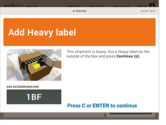
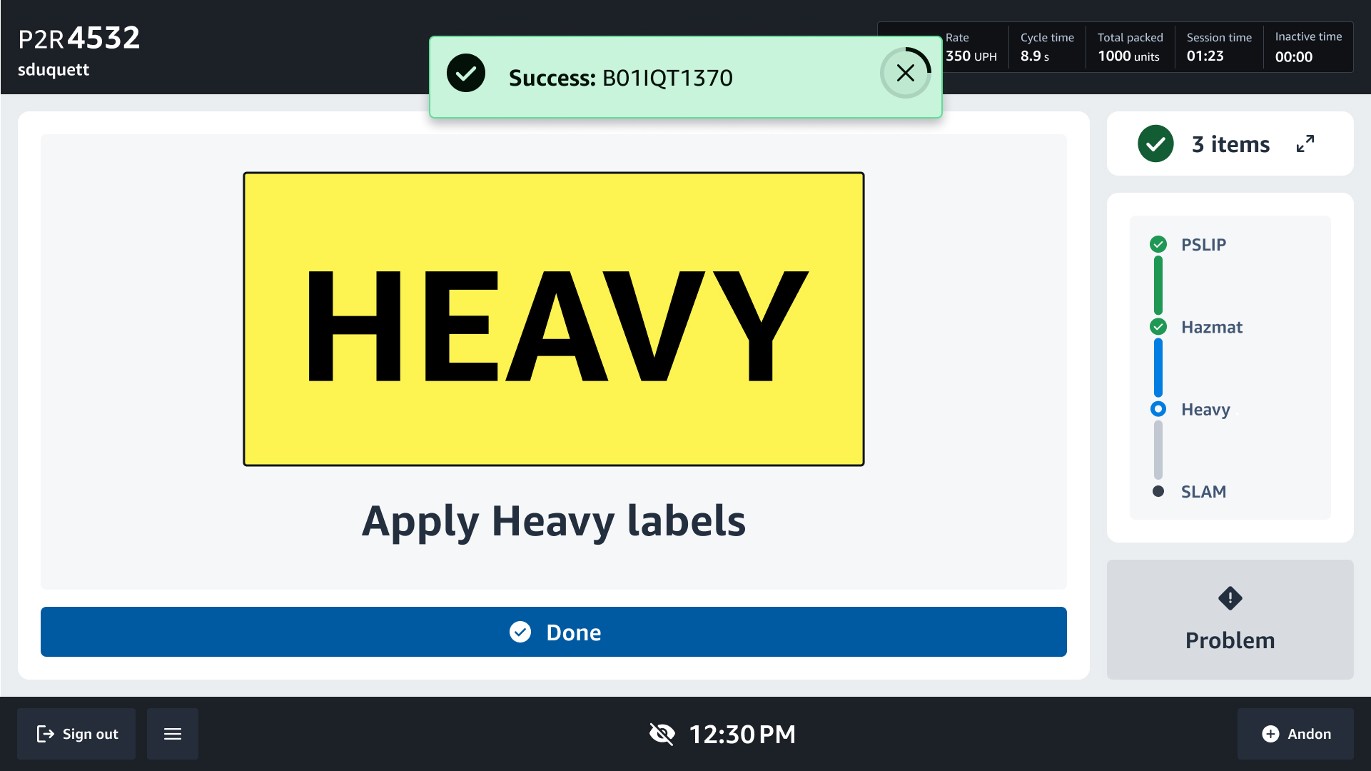
Heavy label CTA – Legacy vs. updated UI
Throughout the project, I ran approximately 15 virtual design review sessions with area managers and associates across North America and Europe. These were interactive prototype walkthroughs simulating the full packing flow, where I asked participants to flag concerns or potential issues.
The feedback was largely positive, but a consistent theme emerged: resistance to simplicity. Area managers and associates were accustomed to the legacy UI showing everything at once. When they saw the stripped-down, step-by-step flow, the reaction wasn't "this is wrong," it was "this is different." People worried that removing information would confuse associates or slow them down.
In every session, I walked through the design rationale: the research showing that associates glance for seconds, that they don't read item lists, that they already know their station layout. When people understood the reasoning, they came around. But the discomfort with change was real and persistent.
The MVP launched at the pilot site in Louisiana. It did not go smoothly.
When the dev team arrived on-site to implement the new design at a handful of stations, area managers pushed back. They preferred the legacy design. They wanted all the information on screen at once. The simplified, directed flow felt too different, and there was real resistance to moving forward with it.
Rather than reverting, I advocated for the design directly. I held sessions with resistant area managers, walking them through the research and rationale one by one. Through those conversations, I got a few people on board, and those early supporters started talking to their peers. Area managers who understood the reasoning began championing the design to other area managers, building confidence across the site organically. It wasn't a top-down mandate. It was grassroots buy-in, built through evidence and repetition.
The position remained straightforward: we have research supporting this direction. If the data shows the new design is slowing associates down, increasing errors, or causing confusion, we'll reconsider. But we owe it to the research to let it run.
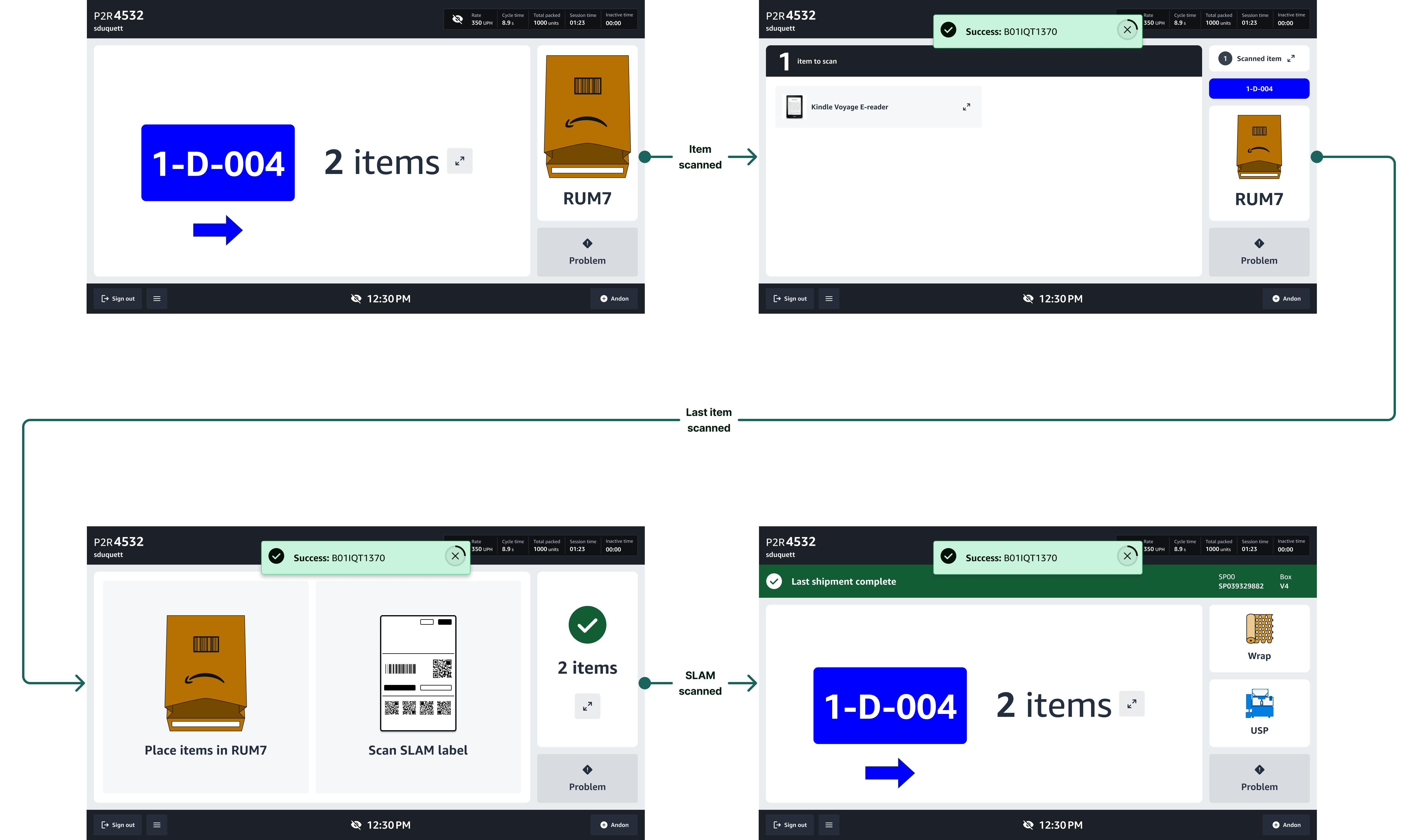
End-to-end packing flow (2 item shipment packed in a bag)
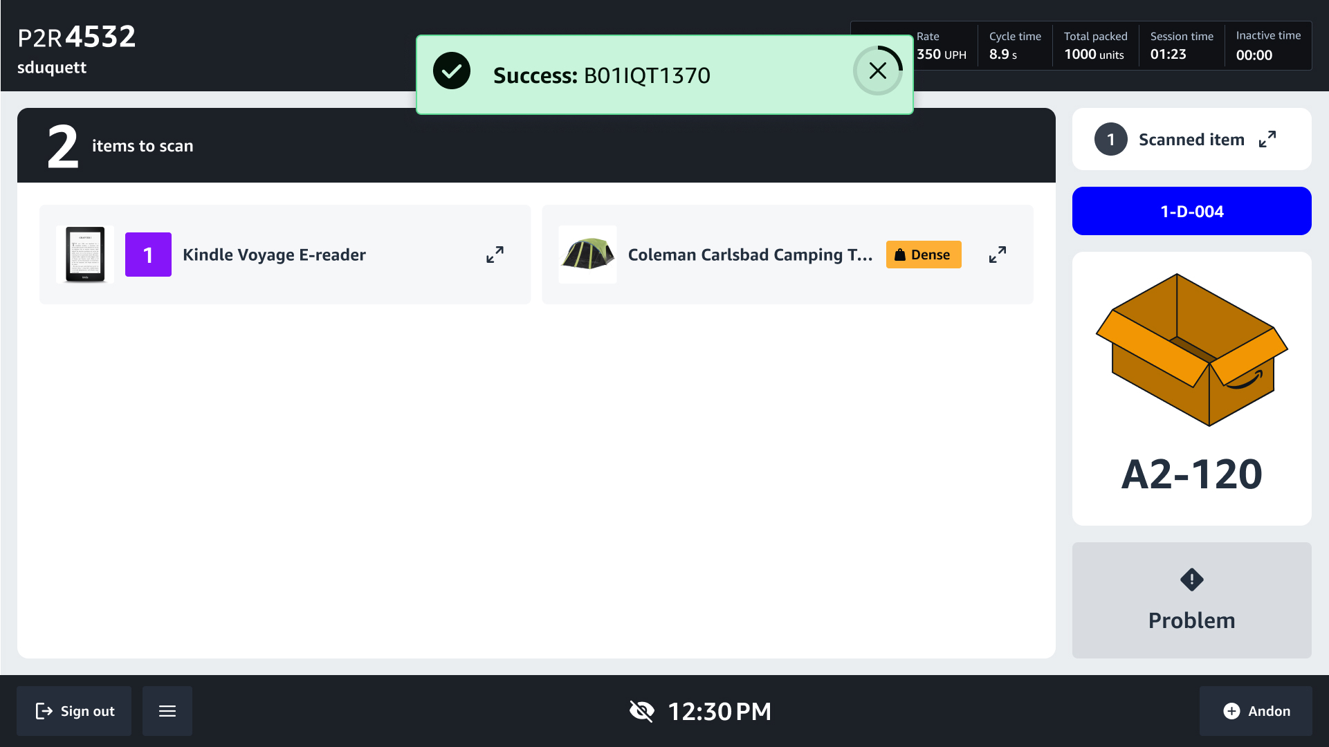
Pack App 2.0 replaces the legacy packing interface with a directed, step-by-step flow that shows associates only what they need at each moment. The UI advances automatically as actions are completed, primarily through scans. Associates never have to decide what comes next. The screen tells them.
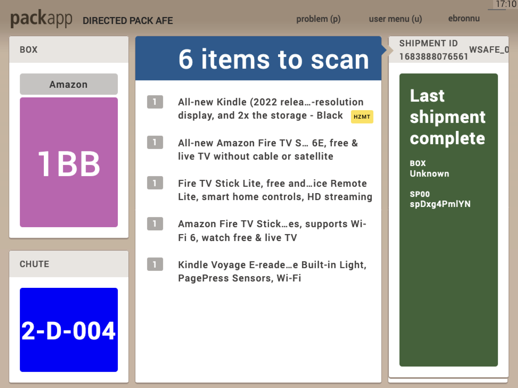
When an associate signs in by scanning their badge, they receive their first shipment. The assignment screen shows a large card with the chute color, ID number, and the quantity of items to collect. A smaller card on the right shows the packaging type (box, bag, or USP), telling the associate where to bring their items. For batched singles, the screen adapts: the chute location and number of shipments appear in the top-left, and instead of an item quantity, the screen simply reads "Scan any item."
Once the first item is scanned, the screen transitions to the scanning experience. For multi-item shipments, all required items appear on screen with images. As each item is scanned, it fades from the "Items to scan" card, and the "Scanned items" count increases. A success toast appears at the top of the screen confirming each scan. If the wrong item or barcode is scanned, a red error toast appears immediately. If an item is missing, the associate can see exactly what's left to scan, with a clear image, rather than guessing what's unaccounted for.
After all items are scanned, the screen changes to show the next required action, one step at a time. The specific sequence varies based on the shipment configuration — box, bag, USP machine, or batched singles — but each step advances only when the associate completes the required action (scanning a label or pressing confirm). The associate never sees steps out of sequence or instructions for actions they haven't reached yet.
After the final scan, a success message appears ("Last shipment complete") and a new shipment is automatically assigned. The cycle begins again.
The MVP launched at a pilot site in Louisiana, with plans to expand across North America and eventually reach 100,000+ associates. Early results from the pilot are promising.
Increase in packing speed (UPH) at the pilot site
Reduction in time to proficiency for new associates
Fewer cardboard boxes used, enabled by the new wrapping workflow
Lower error rates compared to the legacy UI
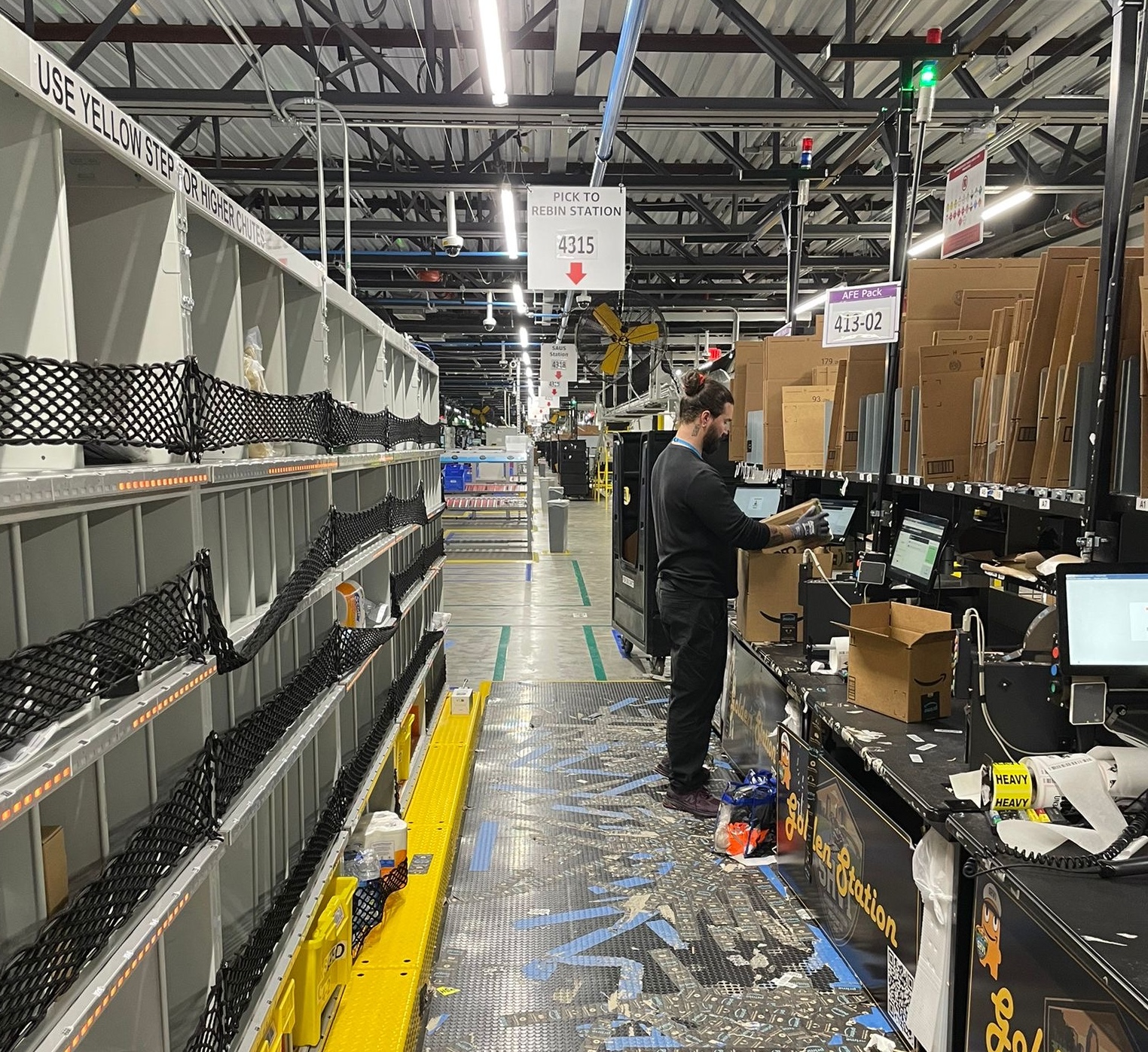
Packing orders alongside associates was the most valuable research I did. Reading about a workflow in a document is completely different from standing at a station, scanning items, building boxes, and feeling the pace of a 10-hour shift. Physically doing the work gave me intuition that no amount of remote research could have provided, and it earned credibility with associates and area managers who could tell I understood their environment firsthand.
I was genuinely excited about the color-coded zone concept. It felt elegant: match the UI to the physical environment, reduce cognitive overhead. But the time trial showed no improvement. Cutting it was the right call, and it saved the business real money. The best design decisions aren't always about what you add. Sometimes the most impactful thing you can do is remove an idea that doesn't earn its place.