
Making subscription bundles easier to discover, understand, and manage for millions of Prime Video customers, contributing to $230M in bundle-attributed revenue
Prime Video offers a complex ecosystem of content: included Prime titles, add-on subscriptions (Channels like Paramount+, Showtime, Max), transactional rentals/purchases (TVOD), and pay-per-view events.
Increasingly, content partners wanted to bundle offerings together—think "Sports Pass" (multiple sports channels) or "Movie Night Bundle" (rent 3 films for the price of 2). But these bundles were buried, confusing, and difficult to manage.
Amazon is uniquely positioned to offer superior bundle experiences because no other streaming service operates across SVOD, Channels, TVOD, and PPV at this scale. If we could make bundles discoverable and understandable, we could drive subscription growth, increase transaction volume, and differentiate Prime Video in a crowded streaming market.
Prime Video's bundle experience was fragmented and confusing. Many customers had no idea bundles existed. When they did find them, the value proposition was unclear: What's included? Am I already subscribed to part of this? Will I be charged twice?
Bundles were scattered across the platform with no consistent visual identity. A customer browsing "Sports" content might never know a Sports Bundle existed. There was no dedicated discovery surface, no persistent merchandising, and no way to browse all available bundles.
When customers did find bundles, the details were vague. "Subscribe to Sports Pass for $19.99/month" sounds fine until you realize you're already paying $9.99/month for one of the included channels. Are you saving money? Will you be double-charged? The math wasn't clear, and neither were the contents.
Once subscribed, bundles were hard to manage. Customers couldn't easily see what they were paying for, cancel individual parts, or find content within their bundle. TVOD bundles (e.g., "Rent 3 movies") were especially confusing because they mixed subscription and transactional models.
This wasn't just a design problem—it was also technical and business. Bundles involved complex billing logic (prorated credits, overlapping subscriptions), legal restrictions (some content couldn't be bundled in certain regions), and partner agreements (we couldn't change pricing without approval).
I led UX design for the bundles initiative, working across three bundle types: Channel bundles (multiple subscription channels), TVOD bundles (rent/buy multiple titles), and subscription-gated PPV bundles (access PPV events with a subscription).
Competitive analysis, experience audit, usability testing, synthesis of foundational research
Journey mapping, persona creation, prioritization, balancing customer needs with technical constraints
Wireframing, prototyping, design specs, accessibility documentation, and iterative refinement
Given the complexity and scale (millions of customers across devices), I focused on a research-driven, iterative approach:
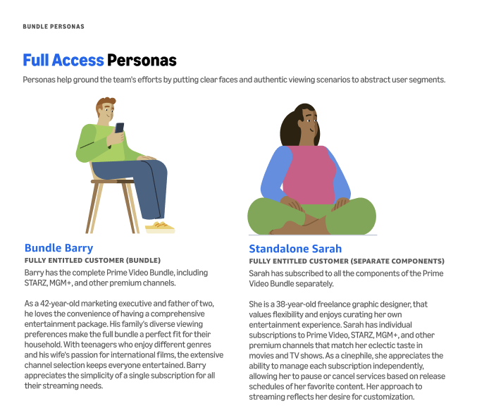
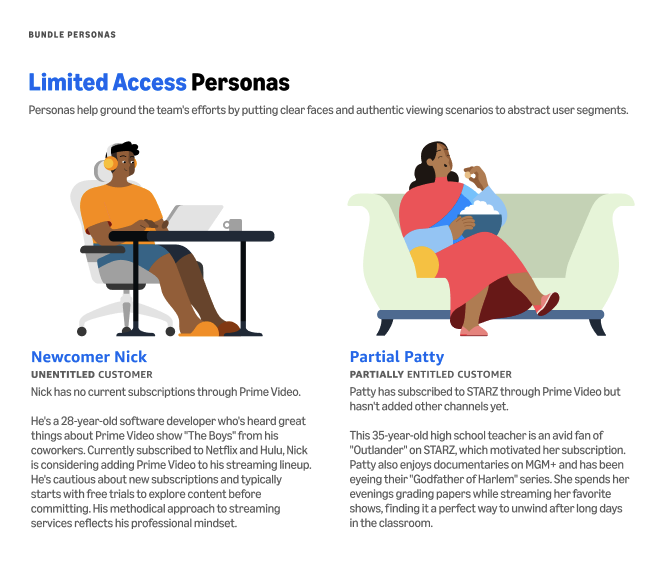
Personas for full and limited access customers
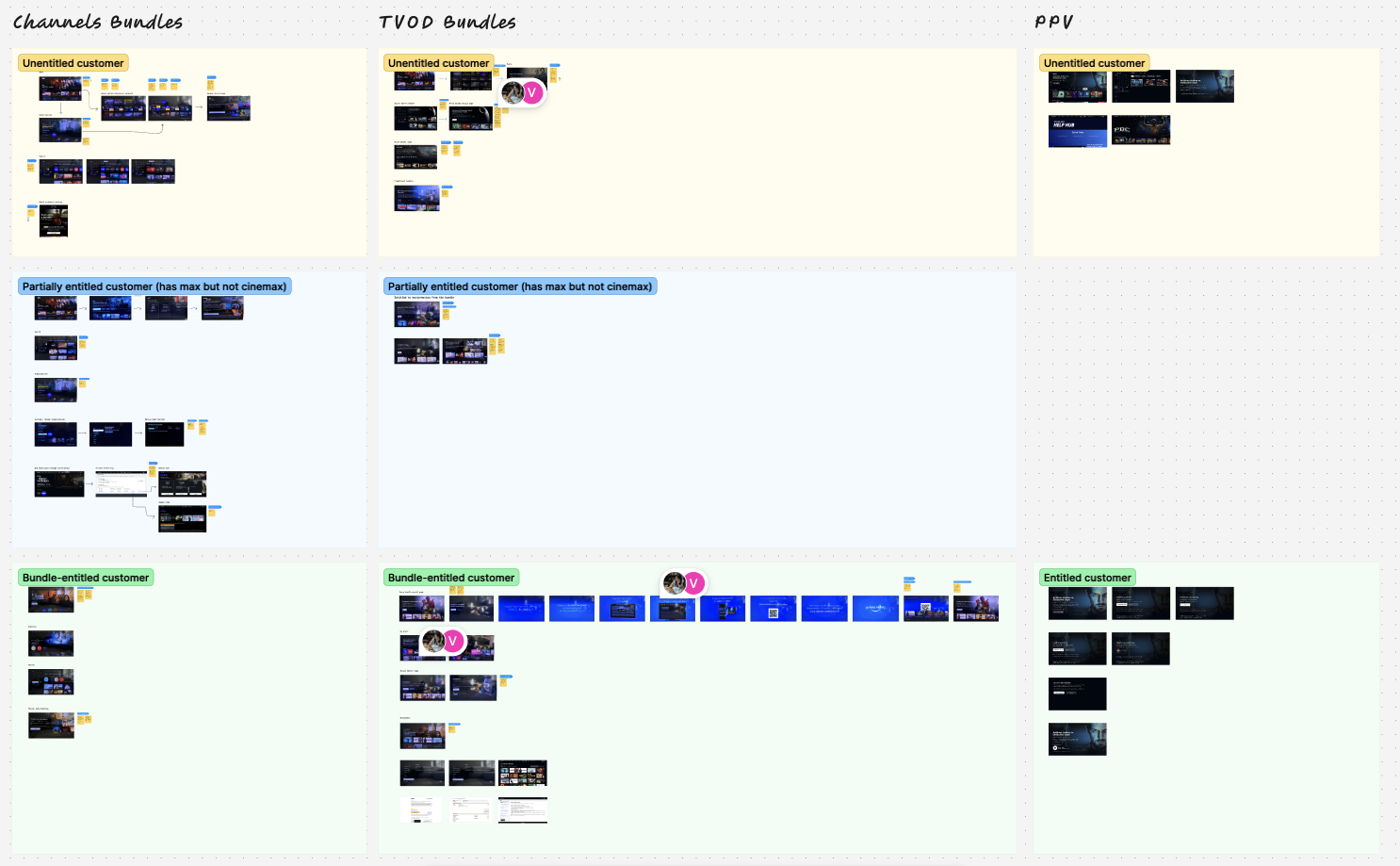
Existing experience audit
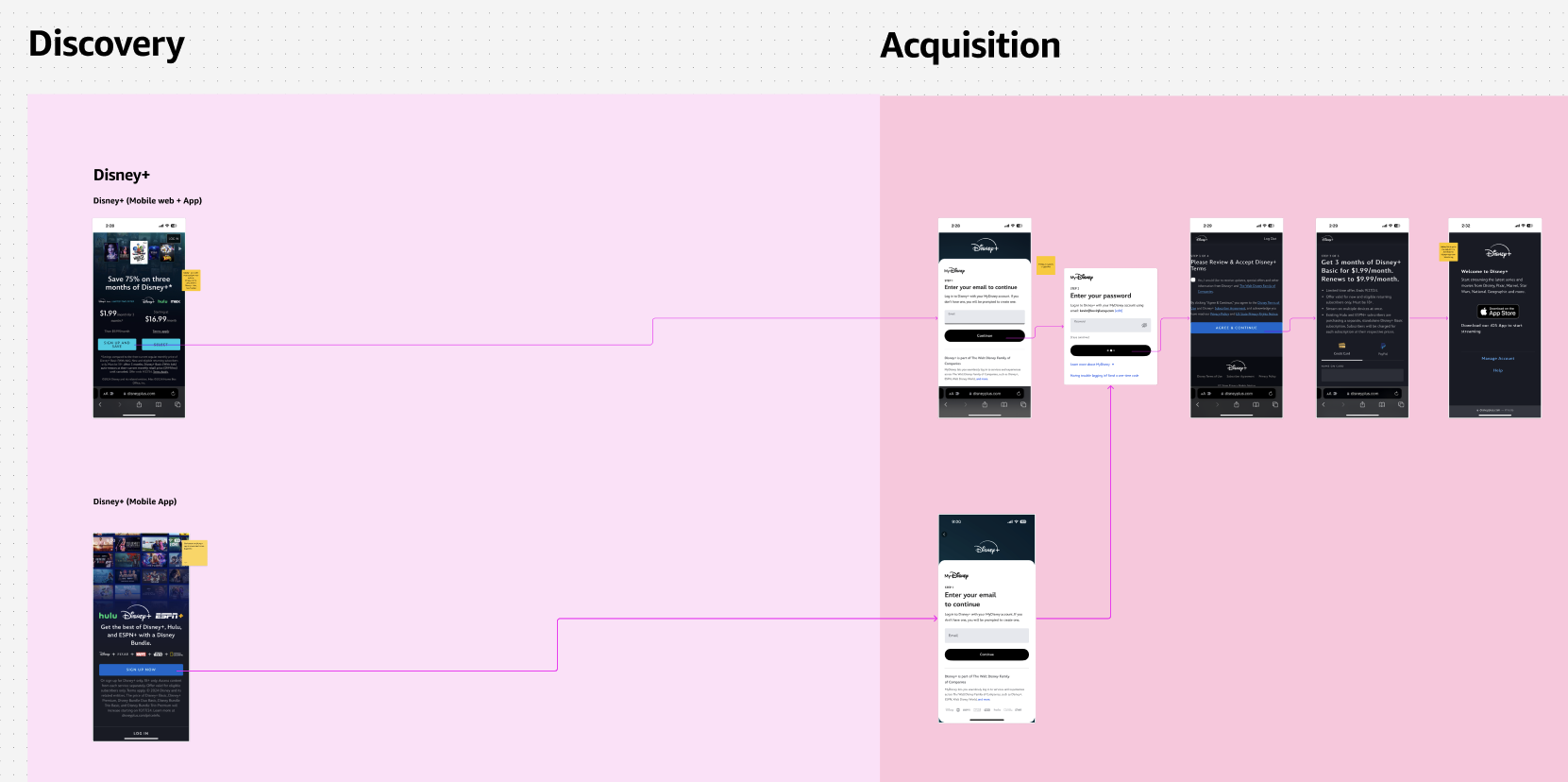
Competitive analysis screenshot
Most customers didn't know bundles existed. When they did encounter them, they looked like any other subscription offer—no visual distinction, no "bundle" label.
Design implication: We needed a consistent visual identity for bundles that would make them instantly recognizable. We also needed to increase discovery touchpoints—homepage modules, browse surfaces, and recommendations.
The biggest friction point was uncertainty: "If I already subscribe to one channel in this bundle, will I save money or get charged twice?" Customers wanted upfront pricing transparency.
Design implication: Pricing had to be front and center, with clear breakdowns. If a customer already had overlapping content, we needed to surface that immediately and explain how credits or discounts would work.
Transactional bundles (e.g., "Rent 3 movies for $9.99") mixed subscription and purchase models in ways that confused customers. They didn't understand if the bundle was a one-time purchase or a subscription.
Design implication: TVOD bundles needed extra clarity: clear expiration dates, "rent" vs "buy" language, and visual indicators showing what content was already available through subscriptions.
Once subscribed, customers struggled to find content within their bundles. Some bundles had dedicated hubs, others just dumped content into the main browse experience.
Design implication: We needed a consistent pattern: every bundle should have a dedicated detail page showing all included content. Subscribed bundles should be surfaced in settings with clear management options.
I mapped the customer journey across four key stages, identifying pain points and opportunities at each:
Working with PM, I prioritized use cases based on customer impact and technical feasibility:
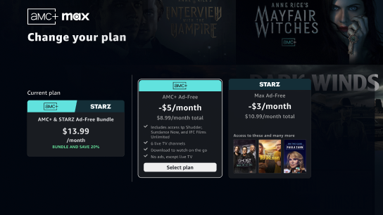
I explored multiple layout variations for bundle detail pages, discovery locations, and management flows:
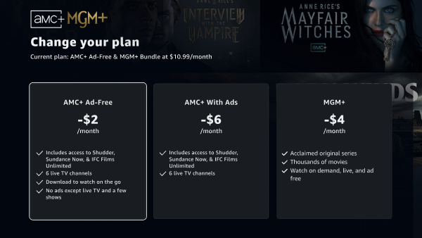
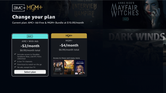
Change your plan design iterations
I conducted usability testing with 8 Prime Video customers, showing clickable prototypes for all three bundle types (Channels, TVOD, subscription-gated PPV). Participants were asked to discover and evaluate a bundle, make a subscription decision, and navigate within a subscribed bundle.
Customers wanted to see pricing and savings before content details. The content-first layout felt like marketing fluff. Transparency matters more than persuasion.
Customers were confused about rental periods and wanted that information upfront to avoid accidental charges.
Bundles got lost when mixed with individual titles. A dedicated "Bundles for You" module was significantly more effective for discovery.

Usability testing notes and synthesis screenshot
Based on testing and stakeholder input, I made several key design decisions:
The detail page leads with pricing and savings ("Save 30% vs subscribing separately"), followed by a breakdown of what's included. Content titles/channels appear below, with clear navigation to individual items. This prioritizes transparency over persuasion.
TVOD bundles got unique UI elements: expiration dates, "Rent" vs "Buy" labels, and warnings if a customer already owned included content. This reduces accidental duplicate purchases and clarifies the transactional nature.
Once subscribed, customers get a dedicated hub ("Your Sports Pass") showing all included content with easy navigation. This answers "What am I paying for?" and makes it easy to cancel if needed.
All bundles receive consistent visual treatment (icon, badge, color) to create immediate recognition across all surfaces. The "Bundle" label and savings callout appear prominently on every bundle touchpoint.
The final bundle experience spans multiple surfaces and devices. Here's what made it into production:
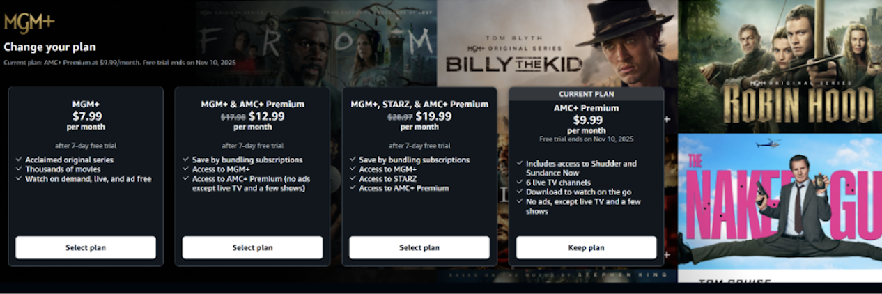
Redesigned detail page with price-first layout: pricing and savings at the top, followed by a clear breakdown of included content (channels or titles), and navigation to individual items. TVOD bundles show expiration dates and rental/purchase clarity.
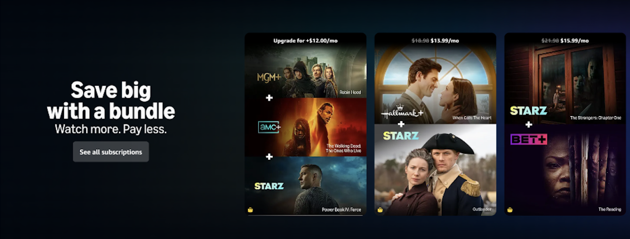
Dedicated homepage modules ("Bundles for You") and a new "All Bundles" browse page where customers can filter by type (Channels, TVOD, PPV) and explore all available offers.
A dedicated 2x3 tile carousel on the Subscriptions page showcasing all eligible channel bundles with dynamic pricing. The carousel displays strikethrough pricing (e.g., "$27.99 $20.99/month") and uses a personalization algorithm based on customer watch history to rank bundles.
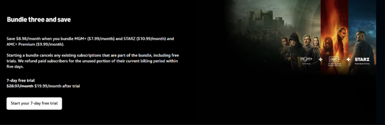
Launched a flagship 3-channel bundle (MGM+, STARZ, AMC+) at $19.99/month, offering customers 31% savings versus individual subscriptions ($28.97 total). This became the template for future multi-channel offerings.
Updated the "Subscriptions You May Like" (SYML) carousel to include bundles ranked using a heuristic model based on channel component relevance scores.
Customers already subscribed to one channel component see tailored upgrade messaging (e.g., "Upgrade for +$12.00/mo") with clear value communication.
Warning banners surface when a customer already subscribes to part of a bundle, with clear explanations of how credits or discounts work. This reduces purchase anxiety and builds trust.
Channel bundles hero placement on homepage
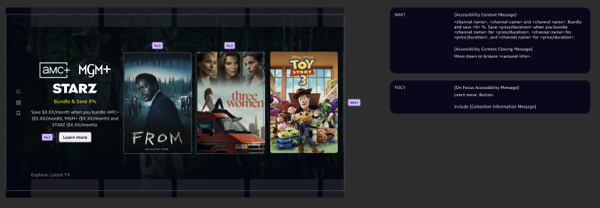
Channel bundles carousel
Upgrade flow
Direct signup page
Increase in 3P bundle starts (+28.6K annually) from Bundle and Save carousel launch
Increase in 3P bundle starts (+67.5K annually) from personalized recommendations
Increase in Prime Video streaming days (+1,072K annually)
Increase in subscriptions contribution profit (+$429K annually)
On track for bundle-attributed revenue by end of 2025 (+243% YoY growth)
Working within technical and business constraints forced me to think differently. Instead of waiting for the "perfect" billing system, I found clever UI solutions (warning banners, overlap messaging) that solved the customer problem without requiring backend changes. Constraints aren't blockers—they're guardrails that force better thinking.
Working closely with product, design, and engineering teams was essential to align on goals and constraints. Regular syncs and feedback loops helped us iterate quickly and avoid misalignment.
In consumer products serving millions, small trust signals matter. Showing pricing upfront, warning about overlaps, and clarifying expiration dates might complicate the sale in the short term, but they build long-term customer relationships. Transparency isn't just ethical—it's good business.
I assumed customers wanted a content-first layout ("show me the movies!"), but testing proved otherwise—they cared about pricing and savings first. Usability testing caught this early, preventing a misaligned launch. Always test your assumptions, even when you're confident.
Bundle discovery is just the beginning. Future work includes: