
Instacart App Redesign
Instacart is an American company that operates a grocery delivery and pick-up service in the United States and Canada.
Challenges
Implementing design changes that would not only benefit vegan shoppers but also customers with other dietary needs.
Objective
The goal of the project was to improve the online grocery service, specifically, the app's user experience that best serves vegan grocery shoppers' needs and goals.
My Role
UX Designer
Define key product features
Site map
Wireframes
Mockup
UX Researcher
Interview users
Competitive analysis
Synthesize research
Persona creation
Empathy mapping
Journey mapping
Usability testing
Timeline
6 weeks
August - September 2020
Research Overview
Heuristic Review
Identified usability problems with individual elements and how they impacted the overall user experience
Competitive Analysis
Searched for similar grocery delivery services and analyzed three competitors
Most notable finding: Prime Now already has a vegan shopping section in the app labeled “Plant-based cravings”, as well as several other ways of finding vegan food options
Personas
Created three personas of users who would use Instacart
Empathy Mapping
Created one empathy map utilizing one of the personas’ experience using Instacart as-is
Journey Mapping
Outlined the journey through the current app experience using one persona
User Interviews
Recorded interviews with current Instacart users
Prioritization Matrix
Ideas for innovation were organized in a prioritization matrix

Heuristic Review

Competitive Analysis
Personas
Empathy Map
Journey Map

Prioritization Matrix
Synthesize
Using Miro and Mural, I completed a competitor analysis, three personas, and an empathy map to better understand the target user (Someone who would be searching for vegan food options via a grocery delivery service).
Using Google Docs, I completed a heuristic review and transcribed an interview with a person who is vegan and uses grocery delivery services.
Using Whimsical, I created a user journey map and a prioritization matrix, which helped me select one idea for innovation.
One Area for Improvement
The only way to find vegan food options is to type in specifically what you’re looking for. Someone who has been vegan for 10+ years may know exactly what they are looking for and could accomplish that task, but they will not be able to browse freely for vegan options. The workaround is to type in a general item such as ”milk”, and then click the ”filter by” button to find dairy-free milk options. Because of this, someone who is newly exploring a vegan diet will likely have a difficult and time-consuming experience finding what they’re looking for.
Addressing the Problem
My initial hand-drawn wireframe included a vegan-specific browsing area, but I noticed that the Instacart app has two ways of finding food in the bottom navigation feature. They are called ”shop” and “explore”, which I find confusing. Not really seeing the point in this, I briefly looked at the competitors again. Almost all of them have the “shop” and “explore” content in one place. I adjusted my second wireframe to reflect that change.
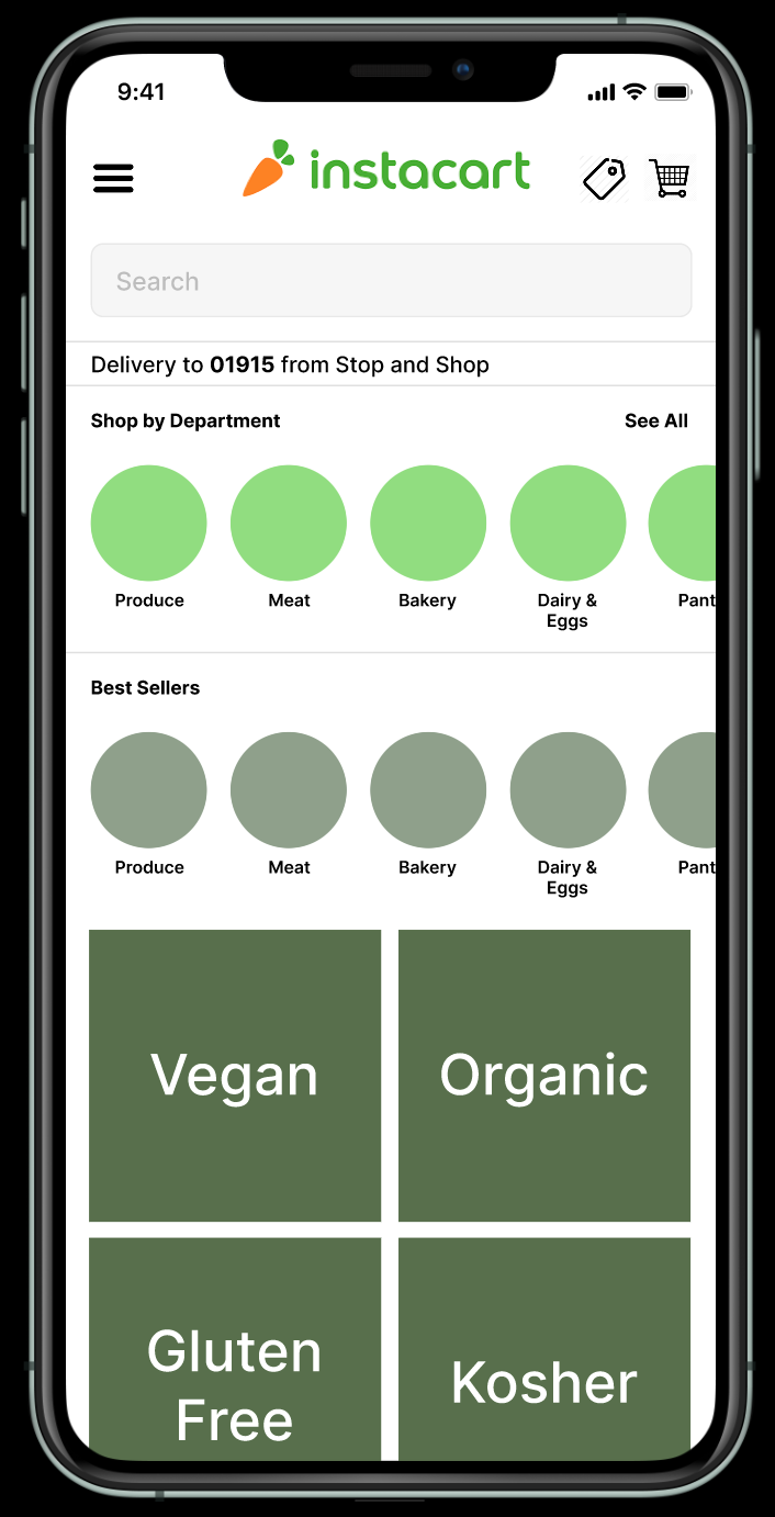
The second wireframe combined the “shop” and “explore” features and eliminated the bottom navigation bar altogether. The “savings” section moved to the right of the “cart”. Departments are oriented so that you can scroll right, which allows a user to see “Vegan” on the home page without scrolling or searching for it. I believe this change allows for better browsing overall, not just for vegan users.


Figma Mockup
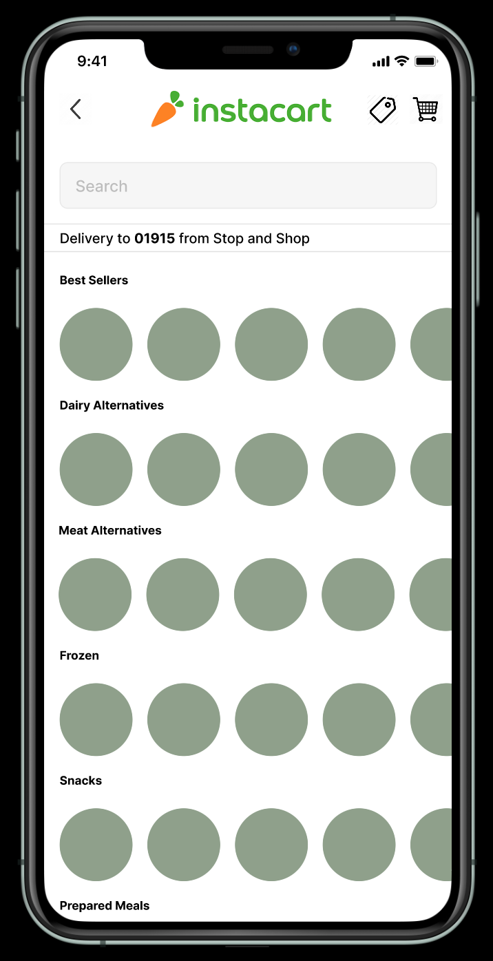
I used the second wireframe sketch to create a mockup in Figma. Additionally, the ”Vegan” category is clickable which displays a mockup of what that page would look like
Results
I redesigned the architecture of the app to simplify choices and create a more intuitive navigation by:
Condensing the size of the categories
Condensing the number of categories
Condensing the bottom and top navigation
Creating a separate vegan shopping experience